Analysis
Phenomenas to be explained.
During the month of September in the year 2020:
-How does Age Distributions fared in the city station, does particular stations attract different age groups?
-Could the reason of short trips (1-5 mins) came from new customers' experiments with cycling?
-Which is the station or area in which most trips started or ended?
-Since different stations may attract different age groups, what are the common tripduration?
Getting a dash board that can answer different other answers.
Using the filter:
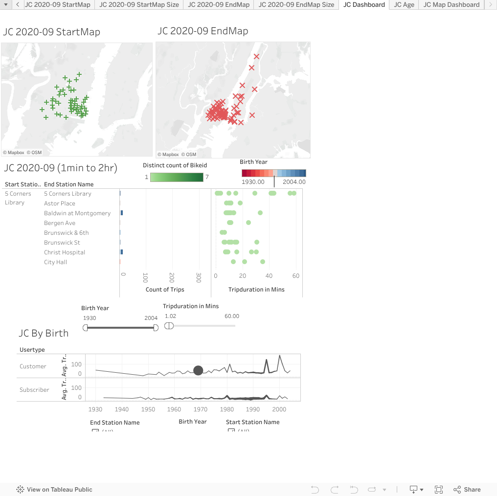
The Dashboard is designed to look at details, not the overview.
It was made so that the information from each station can be inferrred with a click.
The Gantt bar will tell the info based on the age-range and whether a station had more popularity with a certain age group.
The dots describe how many bikes are used in that months for durations of the trips.
Discoveries:
By visual inspection
1. Most trips do not reach over 1hr15mins mark.
2. There is a unusual high amount of trips from those born from the year 1969. Could it be that it is default age for the app input, and people just too lazy to change? In that case data for age range of "consumer" may be highly faulty.
3. Trips that came from start stations are highly clustered together. But End Stations are slighly more disperse. There are favorite areas for starting a bike ride but not for ending ones.
4. Trips from some stations are overwheminly likely to end in that station (Liberty Light Rail, City Hall, Morris). But it is not always the case (Jakeson Square, ..etc). Further investigation (ground floor) might yeild answer.
5. Using the line chart, more trips of the subscribers are from the age born of 1980-1995.
6. The people born in 1980, 1995, 2000 had a higher average trip duration than others for unknown reason.
7. By filtering out, each station tell a slightly different story.